Have you received emails or phone calls saying your website is not responsive or mobile friendly (see Sample Scare-Tactic Email below)? If so, please ignore them. These messages are simply trying to frighten you into paying for something you already have with our Sitebuilder website hosting system.
It's not easy to design websites that play perfectly well with others. Today's plethora of desktop, laptop, and mobile devices offer varying screen sizes, orientations, browsers, and operating systems. Although no single website can work exactly the same on every device, all Sitebuilder websites offer a "mobilized" feature called responsive HTML5, which adapts to a variety of devices (see Blog Article announcing Sitebuilder System 4.7).
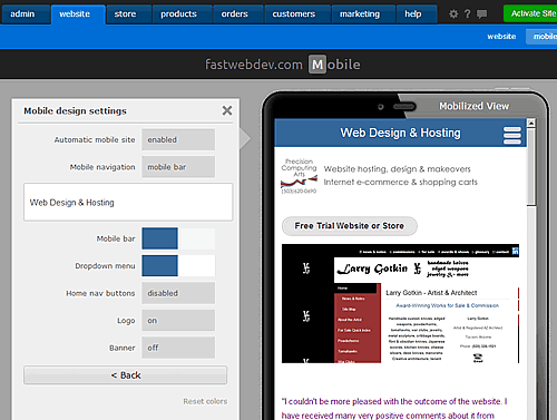
Using Sitebuilder Mobile Website Features
To access and customize the mobile website feature, log into your website account and select the Mobile Website link on your Admin screen or Page List. From here, you may:
-
Customize several aspects of your mobile site, including whether to enable or disable it, the website's title, mobile navigation bar, drop-down navigation bar, home navigation buttons, logo and banner (on or off).
-
Build a separate (typically smaller) mobile-only website.
-
Preview the website in a "mobilized view" (this provides an approximation of the mobile user's experience; be sure to test on a "real" phone for a more accurate view).
More Adjustments May be Needed
The automatic mobilizer in the Suitebuilder system goes a long way toward making your website compatible with most mobile devices. However, your site will not display the page and site sidebars or drop-down menus on mobile devices due to limited screen "real estate."
5/30/14 Update: Graphic menus and submenus do not work well with responsive mobile sites. You will need to use text/css menus and submenus for fully supported mobile sites.
2/23/14 Update: The display order of various components on your mobilized page may not appear in the order you expect. Mobile reformat takes everything in each section (2,3,4) and stacks them on top of each other. You can change this using the column component (Design/Layout > Layout Columns). For example, if a non-phone screen shows group boxes from left to right (first all of row 1 items, then all of row 2 items, etc.), move the items into columns of the column component to make the boxes stack on top of each other.
If the above mentioned areas provide important navigation or information, or you encounter other design issues while viewing your mobile website, we may be able to help. Please contact us for a consultation. When reporting a concern, please let us know the type of device, browser, orientation, and operating system you are using.
We can test websites on:
-
Windows PC-based browsers -- Chrome, Internet Explorer 8, Firefox, Safari (Windows XP).
-
Apple iPad -- Safari, Chrome (IOS7).
-
Apple iPod Touch Gen 5 (like an iPhone but without cellular capability) -- Safari, Chrome (IOS7).
Happy browsing!
Sample Scare-Tactic Email
I visited your website and found it to be good and professional. However, I came across some issues pertaining to the website that needs immediate attention.
As per Google's guidelines, a site should be easily accessible on mobile phone, Iphone, and tablets etc. This only can be attained through a Responsive or Fluid layout and this is exactly where your website is off-form. We can integrate your knowledge and experience with our web development and marketing expertise to build the perfect website for your business that complies to the guidelines.
Additionally, as the number of mobile Internet users are increasing, your site needs to be Mobile compliant too. By optimizing the website with the use of proper HTML5 development standard, we can make it mobile compliant too. This can soar the popularity of the website to its utmost extent.
Your business objectives can certainly be presented better with the help of a good web design service. So, please let me know if we can discuss further regarding the website issues and its remedies in regards to get the best of the web results.


